
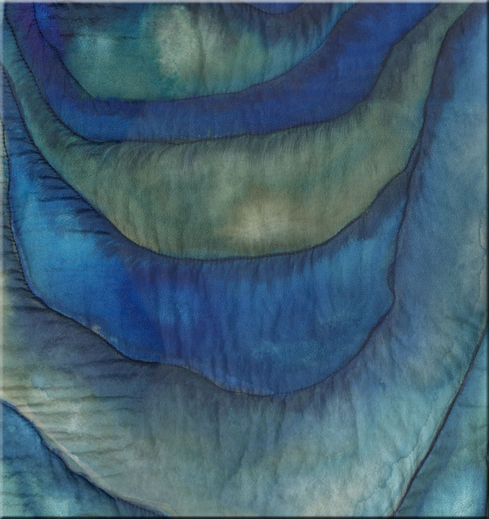
“Iceworld”
79″ x 25″
silk scroll, stitched
Imitating the colours of these landscapes is only partially possible. But at least silk is the perfect material for such a purpose, because paints can flow into one another just as it happens in nature with the colour shades. Also the lucency of silk and paints is perfect for painting such landscapes. More in the next batch of images…


Before I continue presenting more images of this silk scroll I would like to introduce a couple of interesting websites about colour theory and interpretations:
Color Theory Tutorial by Worqx. This is the website of Janet Lynn Ford, which exclusively covers scientific colour theory in a crisp and understandable manner. She covers
* Color Theory Overview
* Color Basics
* Color Systems
* Color Wheel
* Complementary Colors
* After Images
* Color Combinations
* Color & Contrast
* Itten’s Contrasts
* Proportion & Intensity
* Contrast & Dominance
* Shades & Tints
* Color Studies
* Palette Picker
.
.* Color Basics
* Color Systems
* Color Wheel
* Complementary Colors
* After Images
* Color Combinations
* Color & Contrast
* Itten’s Contrasts
* Proportion & Intensity
* Contrast & Dominance
* Shades & Tints
* Color Studies
* Palette Picker
.
Now – this is said specifically about the colour blue:
“Blue is the color of the sky and sea. It is often associated with depth and stability. It symbolizes trust, loyalty, wisdom, confidence, intelligence, faith, truth, and heaven..
Blue is considered beneficial to the mind and body. It slows human metabolism and produces a calming effect.
Blue is strongly associated with tranquility and calmness. In heraldry, blue is used to symbolize piety and sincerity.
You can use blue to promote products and services related to cleanliness (water purification filters, cleaning liquids, vodka), air and sky (airlines, airports, air conditioners), water and sea (sea voyages, mineral water). As opposed to emotionally warm colors like red, orange, and yellow; blue is linked to consciousness and intellect. Use blue to suggest precision when promoting high-tech products.
Blue is a masculine color; according to studies, it is highly accepted among males. Dark blue is associated with depth, expertise, and stability; it is a preferred color for corporate America.
Avoid using blue when promoting food and cooking, because blue suppresses appetite. When used together with warm colors like yellow or red, blue can create high-impact, vibrant designs; for example, blue-yellow-red is a perfect color scheme for a superhero.
Light blue is associated with health, healing, tranquility, understanding, and softness.
Dark blue represents knowledge, power, integrity, and seriousness.”
(from the Color Wheel Pro website)
Interesting isn’t it? But is this valid in general?
“Each colour appeals to the viewer in a way that is characteristic for that colour. This is perceived differently by each person due to his/her different personality and due to the fact that many hues belong to one colour label…Another interesting website from Thomas Seilnacht which is about natural scientific work with a special chapter about colours says:
…the perception of a hue can be changed by the colour environment…
Therefore the characteristics, which are assigned to a certain colour, possess a certain spectrum of positive as well as negative aspects. Nevertheless each colour has its own quality and through that its own connotation and impact, which are valid for most people.” (translated from Farbtheorie und Farbgestaltung by Ingrid Crüger, IPSI Fraunhofer Institut)
“Blue transfers a person into a dreamlike state, the colour makes you wistful, comforts and leads you to an inner view… Blue is the colour of the mind and tunes you into a positive state”.The colour blue enjoys great popularity. But there are exceptions. On my own colour palette the earth colours are dominant and colours which emanate much warmth. But this is – as usual – a question of preference and taste, which cannot be reasoned. I strongly doubt that you can deduct certain personal characteristics from colour preferences.
Otherwise this would mean that if I don’t like the colour blue I lack all the virtues as described above? Well – that needs to be discussed….
.
The colour blue actually does not belong to my regular colour palette. Though it can be refreshing and inspiring to jump out of the box and try something completely different. This became true specifically with my latest series Reminiscences of acrylic paintings about the Olympic Student Village in Munich.
Here is another very interesting website about the psychology of colour codes – Farbcodes – by Andreas Heck. It says about blue: (translated from German)
“It symbolizes: sympathy, harmony, friendliness, friendship, loyalty, confidence, reliability, desire, coolness, cold, fantasy.The latter is not only totally contra-dictionary to the above mentioned connotations but it applies to German language only (to my knowledge): “das Blaue vom Himmel herunterlügen” – literally translated “to lie the blue from the sky” which does not make any sense in English at all – it would rather mean “to lie through one’s teeth”. This means that connotations to a colour which exist in one language or country does not necessarily mean the same in another.
Blue is the colour of distance. A colour appears to be nearer the warmer it is and farther away the cooler it is. Blue creates space, perspective. All colours seem to be bluer in the distance, duller because they are covered by atmospheric layers. Water and air seem to be blue. According to your experience the blue derives from the transparent. The biggest contrast it the earth colour brown, the solid.
Blue is the positive part of the fantasy, utopian ideas are in the distance. But in old German idioms blue was connected with lying. “
On the same website it also says (translated):
“Blue is the complementary colour to orange. Orange is the hottest, blue the coldest colour of the spectrum. Shadows of the sunlight seem to be blue (Cézanne, Van Gogh). Snow shines in blue. Skin becomes blue. Blue is an outdoor colour. Blue is uncomfortable as a room colour (in blue rooms temperatures are always underestimated). Blue in restaurants makes guests look pale and sickly, food with a blue tint looks putrid. Cold blue symbolically is a repellent colour: the colour of insensibility, pride, cruelty..So much about the psychology and theory of colours and back to the blues of the silk scroll and more details.....
But blue also means relaxation, silence, peace. Blue is the colour of masculinity (it was red earlier on) and it is the cool, dispassionate virtues: courage, accomplishment, sportsmanship, independence, concentration. It is the main colour of labour and mind: wisdom, science, accuracy, timeliness.”


~~~~
No comments:
Post a Comment